Bravo (UK)
Jump to navigation
Jump to search
Background: Bravo was a TV channel operating in the United Kingdom. When launched in 1985, it only transmitted on cable TV. In 1993, it then progressed to the Astra Satelite. The programming of the channel started out as a vintage movie channel, before changing into 1997 to adult male-oriented shows. In 2010, Living TV Group was folded into BSkyB. In result of this, Bravo was closed down.
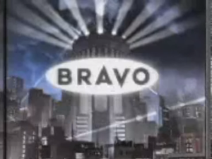
1st Logo
(1985-January 1997)


<iframe frameborder="0" height="227" src="http://wikifoundrytools.com/wiki/closinglogos/widget/genericvideo/cc3e8dfd07d2fdba87fd1a7ac27c6f72d5fc195d" width="401"></iframe>
Nicknames: "The Tower"
Logo: We zoom out of a building, and as we do so, radiowaves come out of the radio tower, and we see two searchlights. When we stop, an oval zooms towards us, and some more radiowaves make the logo. When complete, we see the text:
inside a white oval.
FX/SFX: The searchlights, the radiowaves, the clouds.
Music/Sounds: An orchestral fanfare that then becomes majestic. Usually, it would then end in an orchestral ditty.
Availability: Extinct.
Editor's Note:Those radiowaves look like thunderbolts, and those searchlights look primitive, but this was advanced animation for the late 1980s. The short versions of the logo lookmuch more outdated, but this was to indicate the vintage-based programming of the channel during the time, so it's not that horrible.
2nd Logo
(January 1997-3 February 1997)
Nicknames: "Time Warp Television"
 Logo: We zoom through a time warping background, which changes color. Then everything goes black. After a second, a black Bravo logo zooms towards us, and the background gently fades colors.
FX/SFX: The time warping.
Music/Sounds: A rising dramatic crescendo that builds into a nice peaceful synth hum.
FX/SFX: Bold, blocky animations made to fit the "lads culture". Quite smooth animations, but much more simpler than the last logo.
Music/Sounds: Some rhythmic music.
Availability: Extinct, like the other logos.
Editor's Note: None. It's tamer then the infamous 3rd logo.
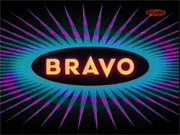
BRAVO
inside a white oval.
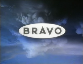
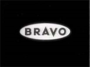
Variants:
- There is a shorter version.
- Sometimes, an even more shorter version of the logo plays on a cloudy or black background (forblack-and-white films).
FX/SFX: The searchlights, the radiowaves, the clouds.
Music/Sounds: An orchestral fanfare that then becomes majestic. Usually, it would then end in an orchestral ditty.
Availability: Extinct.
Editor's Note:Those radiowaves look like thunderbolts, and those searchlights look primitive, but this was advanced animation for the late 1980s. The short versions of the logo lookmuch more outdated, but this was to indicate the vintage-based programming of the channel during the time, so it's not that horrible.
2nd Logo
(January 1997-3 February 1997)

Availability: Same as the 1st logo. This was used to indicate the departure of the channel's original vintage movie programming to the more adult-oriented shows.
Editor's Note: The time warping sequence may thrill someone and would also surprise someone who was expecting the normal 1986 idents on the time, although this is pretty harmless, compared to what follows...
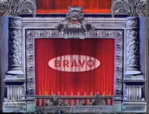
3rd Logo
(3 February 1997-2001)
<iframe frameborder="0" height="207" src="http://wikifoundrytools.com/wiki/closinglogos/widget/unknown/afe33f99a860459f5c7c55d1ce9c78054a44ab25" width="366"></iframe><iframe frameborder="0" height="207" src="http://wikifoundrytools.com/wiki/closinglogos/widget/unknown/91a7f09ba9c35224aa01a777c6791450f85c1c80" width="275"></iframe><iframe frameborder="0" height="207" src="http://wikifoundrytools.com/wiki/closinglogos/widget/unknown/b2f38ace6bc5cc0f24ebb5fba6401049b2f42020" width="368"></iframe>
WARNING: Most of the 1997 idents display disturbing content which is not suitable for younger viewers. Viewer discretion is advised.
Logo: On a black background, we see fires originating from the center of the screen, progressively growing and then dimming. Afterwards many other fires start around the screen (in varying shades of red, blue and orange), and at the same time the outline of the Bravo "Horned O" appears. We then see a big blue fire shrinking in size (as if it were absorbed), and then a explosion occurs, with the entire Bravo "O" burning with alternating blue and red/orange colors. At the same time we see the Bravo text appearing as it gets filled up with fire, and the logo either fades out seconds later or ends instantly.
Variants:
- There were also some variants to go with the ident during 1997-1998. Most of these showed up pretty disturbing material such as: a madman with a screwdriver (slots/flathead) going crazy, eyeballs being taken out from a jar (a fork is also shown), a toilet brush falling on a dirty bathroom, maggots on a plate (looking like it's a cereal; a spoon is also shown), a criminal person appearing and smiling, a grenade falling down on a rabbit farm, a girl licking a cheese grater (note that it plays in reverse), the screwhead from the first variant shaking his head around after speaking, a pierced belly button, a guy in a mental asylum chair, a cat inside a cage, and a goldfish being blended in a blender. These would appear from a blue smoky transition with the scenes following afterwards. However, on the rabbit and goldfish variants, the blue transition appears after the scene, due to the fact that the variants imply the violent subject matter.
- Most of them also have extra parts for their promos.
- Extra variations includes a doctor (who wears a wrestler's costume and putting a yellow gloves), a 3x3 grid blowtorch of different fire colors, a blobbing purple slime, and a man being revealed from the closet.
- Around 1998, there was a more clear version of the logo playing on a yellow background.
- In early 1998, there was a version with a green smoky background.
FX/SFX: The fire startups (for the generic idents). The 1997 variants contain live-action. All were made by Red Pepper Film Company as an "alternative species of television".
Music/Sounds: A waving synth and fire sound effects, then a explosion sound and, lastly, either two synth notes (which uses a guitar layering on the synth music) or a different sound effect played on a waterphone (it is <a href="https://www.youtube.com/watch?v=SFtLvkqHIds" target="_self">infamously used</a> on numerous reality TV shows like Gordon Ramsay's shows to indicate tension). The 1997 variants contain sounds which correspond to the subject matter.
Availability: Same as 1st logo.
Editor's Note: Depending on the ident:
- Original Version: Those live-action startups will unnerve quite a lot of viewers who are unaware, and some may find the second sound FX variant scarier.
- Most of the IDs from 1997-1998: Many of them contain extremely disturbing content to the point of being obscene. The rabbit farm and goldfish variants will almost certainly upset animal lovers. Children, if they were unlucky enough to see these logos, would very likely be spooked and gain nightmares. These idents are absolutely not appropriate to show on television, and stand as some of the scariest idents of all time.
4th Logo
(2001-2006)
Logo: On a dark-colored background (mostly blue), the Bravo O is seen on an orange block, and each pieces move to make the complete logo. The text:
BRAVO
...is seen below the square.FX/SFX: Bold, blocky animations made to fit the "lads culture". Quite smooth animations, but much more simpler than the last logo.
Music/Sounds: Some rhythmic music.
Availability: Extinct, like the other logos.
Editor's Note: None. It's tamer then the infamous 3rd logo.