Logo Variations - Paramount Pictures
Jump to navigation
Jump to search
Logo descriptions by Sean Beard, Matt Williams, Nicholas Aczel, Donny Pearson, Internet Movie Database, and others.
Logo captures by Eric S., wolfie14, lukesams, and others
Wings (1927): The 2012 restoration uses a rather unique editorial decision that's fitting for the first Best Picture Oscar winner. The "100 Years" Variant of the current logo plays out in full, which then dissolves into the end of the 1986 logo (with Paramount Communications byline), followed by the 1974 logo (where the Gulf+Western byline slides in). This backtracking continues up until the 1930s logo, at which point the screen fades to black, and the logo that introduced the film fades in. The logo variant from Red Garters also makes a cameo appearance in this variant.
<embed allowfullscreen="true" height="209" src="http://wikifoundrytools.com/wiki/closinglogos/widget/youtubevideo/e2aea8d0b0d86a596b8da88017008f9f59ad3418" type="application/x-shockwave-flash" width="323" wmode="transparent"/>
____________________________________________________
Vertigo (1958): The standard VistaVision logo, but the logo is darker and in black and white and the clouds are static.
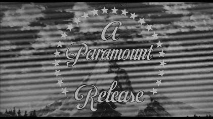
Psycho (1960): The logo plays, but the words "A Paramount Release" are outlined in black. Also, the background has several lines on it. _______________________________________________________________________________________
The Ladies Man (1961): At the end of the movie, instead of the usual variant, we see the entirely different texts, with the circling stars being omitted.
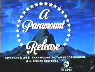
The Son of Captain Blood (1963): Standard logo, but with a copyright stamp and the Motion Picture Association of America logo below the mountain.
_______________________________________________________________________________________
McLintock! (1963): The 2002 logo precedes the film on the 2005 DVD release, but fades in a few seconds into the logo.
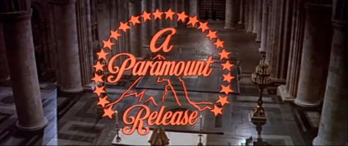
Another print has a completely different Paramount logo.
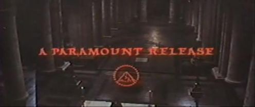
_______________________________________________________________________________________
The regular Paramount "The End" title card is in a different font.
Downhill Racer (1969): Similar to the If.../Paper Moon variant, but with no copyright symbol.
354px|Paramount (1968, B&W)
Most current prints of the film plasters this with the 1975 logo. It's almost the same as the Flashdance variant, but brighter, and it looks like it was put against a shiny wall.
The Godfather (1972): The second and third drafts of the screenplay had this description: "The PARAMOUNT logo is presented austerely over a black background". However, the final film had no logo.
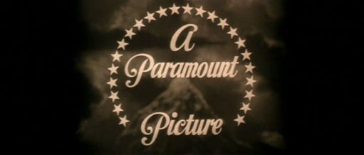
__________________________________________________________________________
The White Dawn (1974): Similar to the If.../Paper Moon variant, but the image has a grainy "old-time-movie" look to it.
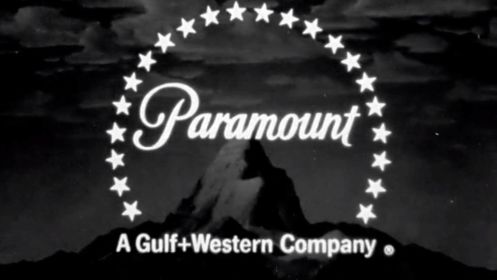
Race for Your Life, Charlie Brown (1977): On some prints, the 1977 logo is on a pink background.
_______________________________________________________________________________________
The Bad News Bears Go to Japan (1978): The mountain turns into Mount Fuji. The Gulf+Western byline is in a different font as well.
Cheech & Chong's Up in Smoke (1978): At the end of the movie, the logo cuts from the closing credits rather than fading in.
_______________________________________________________________________________________
Goin' South (1978): The 1975 logo animates in reverse. Then, the mountain turns into a grainy picture of the mountain.
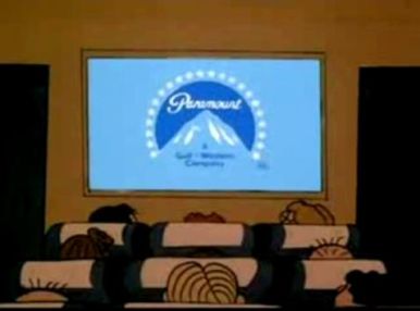
Bon Voyage, Charlie Brown (and Don't Come Back!!) (1980): There is a cameo appearance by the 1975 Paramount logo during the film on an airplane in-flight movie, consisting of the Peanuts Gang sitting on chairs on the plane, and on a screen, we see a movie countdown leader parody, followed by a shot of the finished Paramount mountain logo (albeit with the Gulf+Western byline in blue instead of the usual white). This appeared before a film-within-a-film entitled Laughing Bunnies, which Snoopy and Woodstock were laughing out loud at during the film.
_______________________________________________________________________________________
The Elephant Man (1980): Exactly the same as The Shootist variant.
Logo Variations - Paramount Pictures - CLG Wiki
_______________________________________________________________________________________
Popeye (1980): The 1953 "A Paramount Picture" logo is used, but in black and white.
_______________________________________________________________________________________
Reds (1981): The 1975 logo is on a wild blue-yonder colored background and the near-circle is dark blue with a grayish tint.
________________________________________________________________________________________
Ragtime (1981): Exactly like the Reds variant, but the background is brighter and the near-circle is zoomed out further than usual. Only on VHS releases.
________________________________________________________________________________________
Indiana Jones Series (1981, 1984, and 1989): These logos were replicas of the original 1954 VistaVision "A Paramount Picture" logo, but with a Gulf+Western byline added at the bottom. The mountain fades from the logo, and becomes:
a mountain in South America (Raiders),
Coming to America (1988): The CGI Paramountain forms as usual (with Gulf+Western's byline). It then turns into a real mountain (with stars and text intact), and we zoom in over the top, and past the letters. This is done as Eddie Murphy's character lived in the kingdom beyond the Paramountain. 
Tucker: The Man and His Dream (1988): The 1953 "A Paramount Picture" logo is used. Seen after the "Paramount Pictures Presents" credit. It is however plastered with the 1971 American Zoetrope logo on current prints of the film.
_______________________________________________________________________________________
Scrooged (1988): The word "Paramount" and the byline "A Gulf+Western Company" are in a silver color and the camera zooms over the Paramountain into the "Yule Love It!" promo.
_______________________________________________________________________________________
Black Rain (1989): Standard logo (with fanfare), but fades into the red sun in Japan.
Braveheart (1995): The logo has a gray tint. This was only seen on US prints of the movie. The restored US version has the standard version instead.
_______________________________________________________________________________________
The Brady Bunch Movie (1995), some Peanuts TV specials (1965-2000), and Little Bill (1999, Nick Jr.): The logo freezes and the Viacom byline zooms in further than usual.
Clueless (1995): The logo irises out into the film's opening title.
_______________________________________________________________________________________
Mission: Impossible (1996, Paramount Home Video): There is a special version of the 1988-2006 Paramount Home Video logo. On a gold background, the camera zooms backward as we see "Paramount" in its corporate script font, with the abstract mountain logo in the circle, and 22 stars encircling it. The byline "A VIACOM COMPANY" fades in at the bottom and is smaller. As the logo plays throughout, an announcer says "Paramount Pictures: the best show in town!". This might also appear on any other Paramount video.
_______________________________________________________________________________________
Hard Rain (1998): The Paramount mountain is seen in much worse weather than normal; the camera pans down from the logo to scenes of flooding.
South Park: Bigger, Longer, and Uncut (1999): The Paramount logo fades to a regular green snow-capped mountain that can be seen on pretty much every South Park episode. This was only seen on US prints of the movie, while international prints of the film use the 1999 Warner Bros. Pictures logo, but it still uses the music from the logo.
Sleepy Hollow (1999): The logo has a gray tint, a darker version of the Braveheart variant.
Snow Day (2000): The top half of the logo is tinted blue, and the text in the logo is in a shade of blue, thus making it look "frozen". Also, we hear a snowstorm in the background.
Tomb Raider: The Cradle of Life (2003): The logo is reflected against an oceanic background.
Mean Girls (2004): The "Paramount" text, as well as the stars, are in a shade of blue.
_______________________________________________________________________________________
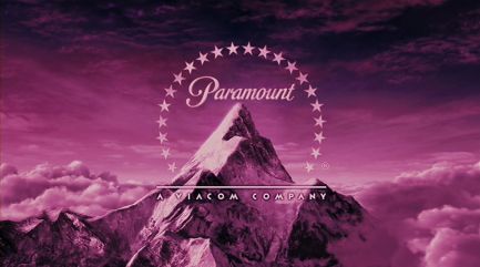
Alfie (2004): The logo is tinted in magenta.
Team America: World Police (2004): The logo animates in reverse.
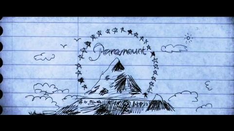
Coach Carter (2005): The logo turns into a drawing (for a split-second) before turning back to normal. There are 25 stars circling the Paramountain in the drawing.
Four Brothers (2005): It's snowing on the Paramount logo and we hear Jefferson Airplane's "Somebody to Love". 
Beowulf (2007, US version): The logo starts off sped up, and then goes back to it's normal speed.
It also has the same appearance as the 2010 variant of the logo, only with the old Viacom byline.
_______________________________________________________________________________________
Drillbit Taylor (2008): The logo is in tannish red.
_______________________________________________________________________________________
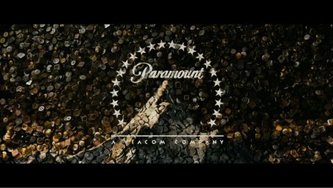
The Curious Case of Benjamin Button (2008): Buttons fall down and form the Paramount logo.
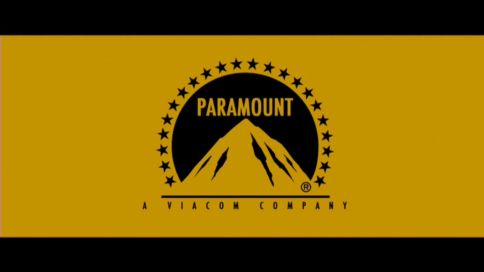
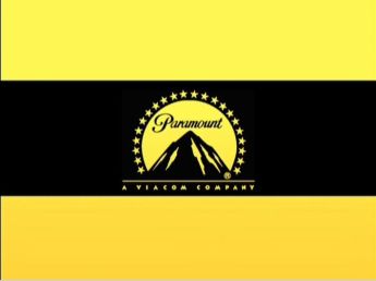
Watchmen: Under the Hood (2009): The logo is banana yellow on a black stripe between two banana yellow stripes, and the other logos (Warner Premiere, Legendary Pictures, and DC) fly in succession with the same variation. 
Friday the 13th (2009): The logo is blood red. 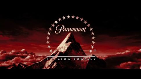
Godfather II (2009): The Digital variant is seen on the game, and the logo is covered in blood.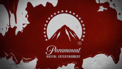
___________________________________________________________________________________
_______________________________________________________________________________________
The Last Airbender (2010): On the first half of the logo, the stars are replaced by water (meant to resemble water-bending).
Jackass 3D (2010): The camera zooms to the right of the mountain, segueing into the new MTV Films logo.
Tomorrow, When the War Began (2010): The logo is cut down to just 2 seconds of the stars whooshing past and 2 seconds of the byline fading in. The Viacom byline is in its 1990-2005 font and the mountain is zoomed in so the tops of the highest 4 stars aren't seen (this is possibly an error in using the logo in the wrong aspect ratio).
Transformers: Dark of the Moon (2011): After the logo is done, the camera pans up into space, segueing into the opening titles.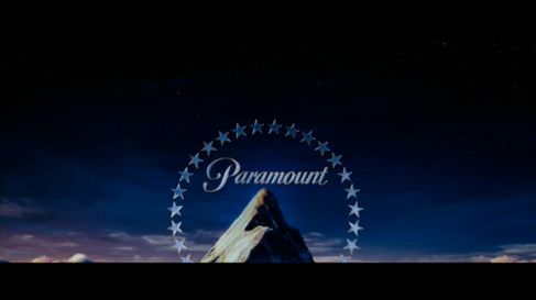
World War Z (2013): The current logo is in a bluish color.
Paranormal Activity: The Marked Ones (2014): The logo glitches like a video camera.
Logo captures by Eric S., wolfie14, lukesams, and others
These are some of logo variations seen throughout the years by Paramount Pictures, with more to be added overtime.
Wings (1927): The 2012 restoration uses a rather unique editorial decision that's fitting for the first Best Picture Oscar winner. The "100 Years" Variant of the current logo plays out in full, which then dissolves into the end of the 1986 logo (with Paramount Communications byline), followed by the 1974 logo (where the Gulf+Western byline slides in). This backtracking continues up until the 1930s logo, at which point the screen fades to black, and the logo that introduced the film fades in. The logo variant from Red Garters also makes a cameo appearance in this variant.
<embed allowfullscreen="true" height="209" src="http://wikifoundrytools.com/wiki/closinglogos/widget/youtubevideo/e2aea8d0b0d86a596b8da88017008f9f59ad3418" type="application/x-shockwave-flash" width="323" wmode="transparent"/>
____________________________________________________
______________________________
São Paulo, Sinfonia da Metrópole (1929): The 1920s logo is seen translucent, behind "DISTRIBUIDA PELA PARAMOUNT" ("Distributed by Paramount" in Portuguese)
__________________________________________________________________________________
Take a Letter, Darling (1942): The 1920s logo is seen on the cover of a folder.
__________________________________________________________________________________
Jasper and the Haunted House (1942): At the start of the film, the 1912-1927 Paramount Pictures logo is imprinted on the bottom of a pie tin. As a song about making gooseberry pie is sung behind it, it shows Jasper (the titular character) making a gooseberry pie, with the film's opening credits representing the pie's ingredients. The opening sequence ends with an image of the completed pie. At the end of the film, Jasper drops the empty pie tin (which he had been using to beat the film's villains over the head) which lands on the ground re-exposing the 1912-1927 Paramount Pictures logo, which now says "A Paramount Picture", as the film ends.
__________________________________________________________________________________
Lady in the Dark (1944): The logo is superimposed on a blue starry sky at the beginning...
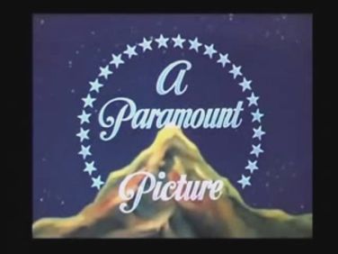
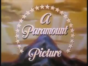
....and at the break of dawn at the end. The text has a shadow effect and is tinted saffron. The mountains in both variations are blurry.
_______________________________________________________________________________________
Santa's Surprise (1947, Noveltoons): One of the stars turns yellow and becomes the star on a Christmas tree.
_______________________________________________________________________________________
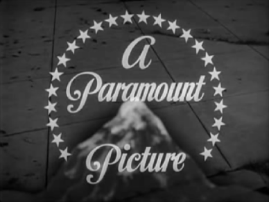
Sunset Boulevard (1950): The logo is superimposed on a street floor.
_______________________________________________________________________________________
Alpine for You (Popeye short, 1951): An end gag that may have started it all. Bluto is on this mountain top, and then Popeye grabs the mountain top (with Bluto on it), with a lasso. He then punches Bluto and lets go of the mountain top, and stars emerge from Bluto's head and form the Paramount logo, as the words "A Paramount Picture" and "Color by TECHNICOLOR" appear below Bluto. Popeye later appears from the bottom of the screen and blows his pipe.
_______________________________________________________________________________________
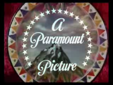
The Greatest Show on Earth (1952): The logo appears on the background of a spinning wheel.
_______________________________________________________________________________________
Popeye, the Ace of Space (Popeye short, 1953): The closing features Popeye smoking his pipe, making the Paramount logo. It was also credited as a "Stereotoon".
_______________________________________________________________________________________

....and at the break of dawn at the end. The text has a shadow effect and is tinted saffron. The mountains in both variations are blurry.

_______________________________________________________________________________________
Santa's Surprise (1947, Noveltoons): One of the stars turns yellow and becomes the star on a Christmas tree.
_______________________________________________________________________________________
Sunset Boulevard (1950): The logo is superimposed on a street floor.

_______________________________________________________________________________________
Alpine for You (Popeye short, 1951): An end gag that may have started it all. Bluto is on this mountain top, and then Popeye grabs the mountain top (with Bluto on it), with a lasso. He then punches Bluto and lets go of the mountain top, and stars emerge from Bluto's head and form the Paramount logo, as the words "A Paramount Picture" and "Color by TECHNICOLOR" appear below Bluto. Popeye later appears from the bottom of the screen and blows his pipe.

_______________________________________________________________________________________
The Greatest Show on Earth (1952): The logo appears on the background of a spinning wheel.

_______________________________________________________________________________________
Popeye, the Ace of Space (Popeye short, 1953): The closing features Popeye smoking his pipe, making the Paramount logo. It was also credited as a "Stereotoon".
_______________________________________________________________________________________
Rear Window (1954): At the end of the film, the curtains of the Jimmy Stewart character's windows close and the Paramount text and stars are projected over the courtyard. This little vignette, reminiscent of the first shot when the curtains open, was removed when Universal acquired the film (which damaged the visual and narrative flow), but was later restored.
_______________________________________________________________________________________
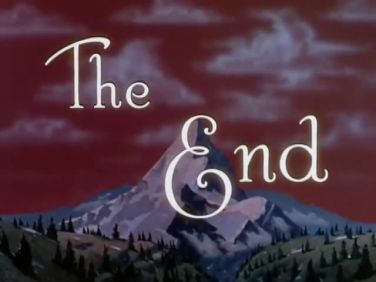
Red Garters (1954): After a few seconds, "A Paramount Picture" fades out, leaving only the stars and the background. The stars spin for a moment, then twenty stars "fly" away from the logo and the other four fade into four lamps inside a stage.
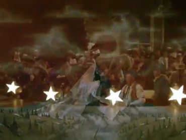
The sky is burnt sienna at the beginning...
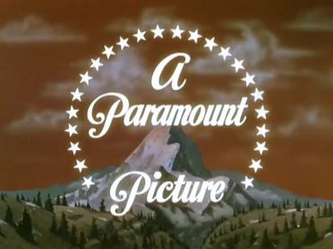
...and completely red/crimson at the end of the film.
_________________________________________________________________________________________
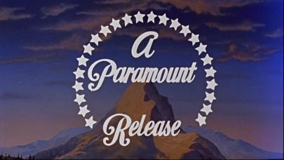
War and Peace (1956): A different representation of the mountain appears. The clouds don't move and the mountain is less realistic than the standard logo.
_____________________________________________________________________________
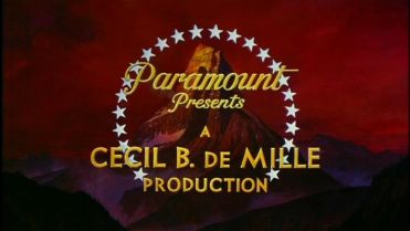
The Ten Commandments (1956): A different reddish-brown mountain (intended to be Mount Sinai) appears with a red sky, with the words "Paramount Presents" in gold and moved to the top near the stars. The words "A CECIL B. DE MILLE PRODUCTION", also in gold appear below. The logo was designed by artist Arnold Friberg, who also developed the typeface for the main titles.
_______________________________________________________________________________________
The Buccaneer (1958): It's the Paramount mountain from the time, only this time the font has slightly changed and seems more "handwritten", and the name is not stretched to fit in the circle of stars. The stars on the mountain are also gray. Under the Paramount name are the words "SUPERVISED BY" in a Roman font and "Cecil B. DeMille" in DeMille's signature handwriting.
Red Garters (1954): After a few seconds, "A Paramount Picture" fades out, leaving only the stars and the background. The stars spin for a moment, then twenty stars "fly" away from the logo and the other four fade into four lamps inside a stage.

The sky is burnt sienna at the beginning...

...and completely red/crimson at the end of the film.

_________________________________________________________________________________________
War and Peace (1956): A different representation of the mountain appears. The clouds don't move and the mountain is less realistic than the standard logo.

_____________________________________________________________________________
The Ten Commandments (1956): A different reddish-brown mountain (intended to be Mount Sinai) appears with a red sky, with the words "Paramount Presents" in gold and moved to the top near the stars. The words "A CECIL B. DE MILLE PRODUCTION", also in gold appear below. The logo was designed by artist Arnold Friberg, who also developed the typeface for the main titles.

_______________________________________________________________________________________
The Buccaneer (1958): It's the Paramount mountain from the time, only this time the font has slightly changed and seems more "handwritten", and the name is not stretched to fit in the circle of stars. The stars on the mountain are also gray. Under the Paramount name are the words "SUPERVISED BY" in a Roman font and "Cecil B. DeMille" in DeMille's signature handwriting.
_______________________________________________________________________________________
Vertigo (1958): The standard VistaVision logo, but the logo is darker and in black and white and the clouds are static.
_______________________________________________________________________________________
Psycho (1960): The logo plays, but the words "A Paramount Release" are outlined in black. Also, the background has several lines on it.
The Ladies Man (1961): At the end of the movie, instead of the usual variant, we see the entirely different texts, with the circling stars being omitted.
_____________________________________________________________________________________________
The Son of Captain Blood (1963): Standard logo, but with a copyright stamp and the Motion Picture Association of America logo below the mountain.

_______________________________________________________________________________________
McLintock! (1963): The 2002 logo precedes the film on the 2005 DVD release, but fades in a few seconds into the logo.
___________________________________________________________________________________
A New Kind Of Love (1963): The stars, as well as the texts are outlined.
_______________________________________________________________________________________
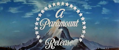
Zulu (1964): Similar to the War and Peace variant, but with grayer colors instead of warmer tones. As seen on a TCM broadcast and some prints outside the USA. The standard version is sometimes used instead.
________________________________________________________________________________________
Zulu (1964): Similar to the War and Peace variant, but with grayer colors instead of warmer tones. As seen on a TCM broadcast and some prints outside the USA. The standard version is sometimes used instead.

________________________________________________________________________________________
Becket (1964): Over the closing scene background, we see the Paramount logo from the time, superimposed in red.

Another print has a completely different Paramount logo.

_______________________________________________________________________________________
The regular Paramount "The End" title card is in a different font.
_______________________________________________________________________________________
If.... (1968) and Paper Moon (1973): The 1968 logo is in black & white.
_______________________________________________________________________________________
Romeo and Juliet (1968): The standard 1954 logo plays, but it's in a box superimposed over a Greek-looking pattern background in yellow iron oxide on gold. Only on the 80s VHS version
___________________________________________________________________________________________
Downhill Racer (1969): Similar to the If.../Paper Moon variant, but with no copyright symbol.
354px|Paramount (1968, B&W)
Most current prints of the film plasters this with the 1975 logo. It's almost the same as the Flashdance variant, but brighter, and it looks like it was put against a shiny wall.
_______________________________________________________________________________________
Aces High (1969): The standard 1975 logo plays, but it is superimposed on an orange background with black ace symbols scattered all over. Also, the entire logo cuts to the start of the movie instead of fading to the blue background print logo. Only on Starz Encore Westerns' prints of this movie.
_______________________________________________________________________________________
The Conformist (1970): The 1968 Paramount logo is slowed down by an optical printer and only appears at the end of the movie.
_______________________________________________________________________________________
The Godfather (1972): The second and third drafts of the screenplay had this description: "The PARAMOUNT logo is presented austerely over a black background". However, the final film had no logo.
_______________________________________________________________________________________
Chinatown (1974): The 1926 "A Paramount Picture" logo is used, but in sepia-tone.

__________________________________________________________________________
The White Dawn (1974): Similar to the If.../Paper Moon variant, but the image has a grainy "old-time-movie" look to it.

_______________________________________________________________________________________
The Godfather Part II (1974): Like on The Godfather, the logo is presented austerely over a black background, though the regular version of the logo is shown at the end. The 1994 VHS release had the normal 1974 logo instead, however. A 16mm print of the film has this logo tinted light purple and bylineless, while on the 2008 Coppola Restoration, the 2002 logo is exactly the same as on The Godfather.
The Godfather Part II (1974): Like on The Godfather, the logo is presented austerely over a black background, though the regular version of the logo is shown at the end. The 1994 VHS release had the normal 1974 logo instead, however. A 16mm print of the film has this logo tinted light purple and bylineless, while on the 2008 Coppola Restoration, the 2002 logo is exactly the same as on The Godfather.
_______________________________________________________________________________________
Nashville (1975): Similar to the White Dawn variant, but with the 1974 logo instead and the image looks more shaky. The scratchy effect was reportedly achieved when director Robert Altman took the negative with the logo on it, threw it onto the ground, and stomped on it.
Nashville (1975): Similar to the White Dawn variant, but with the 1974 logo instead and the image looks more shaky. The scratchy effect was reportedly achieved when director Robert Altman took the negative with the logo on it, threw it onto the ground, and stomped on it.
Hustle (1975), Leadbelly (1976), Lifeguard (1976), The Last Tycoon (1976) and Looking for Mr. Goodbar (1977): The 1975 logo plays normally, but the text "Paramount", the mountain and the blue near-circle are smaller, and the stars are larger. The byline "A Gulf+Western Company" is larger as well and is left unchanged.
_______________________________________________________________________________________
Lipstick (1976): The 1976 logo is on a Han blue background, the Paramount script and stars are larger than the mountain, and the near-circle is navy blue. The stars, Paramount text, and G+W byline appears to be in a light yellow color.
_______________________________________________________________________________________
The Shootist (1976): The 1975 logo is in black & white.
_______________________________________________________________________________________
Race for Your Life, Charlie Brown (1977): On some prints, the 1977 logo is on a pink background.
_______________________________________________________________________________________
The Bad News Bears Go to Japan (1978): The mountain turns into Mount Fuji. The Gulf+Western byline is in a different font as well.
Cheech & Chong's Up in Smoke (1978): At the end of the movie, the logo cuts from the closing credits rather than fading in.
_______________________________________________________________________________________
Goin' South (1978): The 1975 logo animates in reverse. Then, the mountain turns into a grainy picture of the mountain.

_______________________________________________________________________________________
Bon Voyage, Charlie Brown (and Don't Come Back!!) (1980): There is a cameo appearance by the 1975 Paramount logo during the film on an airplane in-flight movie, consisting of the Peanuts Gang sitting on chairs on the plane, and on a screen, we see a movie countdown leader parody, followed by a shot of the finished Paramount mountain logo (albeit with the Gulf+Western byline in blue instead of the usual white). This appeared before a film-within-a-film entitled Laughing Bunnies, which Snoopy and Woodstock were laughing out loud at during the film.

_______________________________________________________________________________________
The Elephant Man (1980): Exactly the same as The Shootist variant.
Logo Variations - Paramount Pictures - CLG Wiki
_______________________________________________________________________________________
Popeye (1980): The 1953 "A Paramount Picture" logo is used, but in black and white.

_______________________________________________________________________________________
Reds (1981): The 1975 logo is on a wild blue-yonder colored background and the near-circle is dark blue with a grayish tint.

________________________________________________________________________________________
Ragtime (1981): Exactly like the Reds variant, but the background is brighter and the near-circle is zoomed out further than usual. Only on VHS releases.

________________________________________________________________________________________
Indiana Jones Series (1981, 1984, and 1989): These logos were replicas of the original 1954 VistaVision "A Paramount Picture" logo, but with a Gulf+Western byline added at the bottom. The mountain fades from the logo, and becomes:
a mountain in South America (Raiders),
a mountain drawing on a gong (Temple of Doom),
and a mountain in the southwest United States (Last Crusade).
_______________________________________________________________________________________
Friday the 13th: Part III (1982) and The Man Who Wasn't There (1983): It's a 3-D version of this logo. However, current prints and the DVD of the former has the standard version of this logo instead.
_______________________________________________________________________________________
Star Trek III: The Search for Spock (1984): The 1975 logo fades out to white at the end.
_______________________________________________________________________________________
Falling in Love (1984): When the 1975 logo finishes animating, it fades into the opening scene of the movie.
_______________________________________________________________________________________
Friday the 13th: Part III (1982) and The Man Who Wasn't There (1983): It's a 3-D version of this logo. However, current prints and the DVD of the former has the standard version of this logo instead.
_______________________________________________________________________________________
Star Trek III: The Search for Spock (1984): The 1975 logo fades out to white at the end.

_______________________________________________________________________________________
Falling in Love (1984): When the 1975 logo finishes animating, it fades into the opening scene of the movie.
_______________________________________________________________________________________
Friday the 13th Part V: A New Beginning (1985, CIC Video): An aircraft from Top Gun flies through the 75th Anniversary logo. This was also seen on any other Paramount video outside of the US released by CIC Video for Paramount's 75th anniversary.
_______________________________________________________________________________________
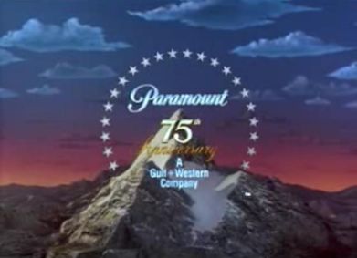
The Golden Child (1986): The first movie with the 1986-2002 logo. The text and byline are in a powder blue color, the word "75th" is white and the word "Anniversary" is yellow-orange.
_____________________________________________________________________________________________________________
_______________________________________________________________________________________
The Golden Child (1986): The first movie with the 1986-2002 logo. The text and byline are in a powder blue color, the word "75th" is white and the word "Anniversary" is yellow-orange.

_____________________________________________________________________________________________________________
Coming to America (1988): The CGI Paramountain forms as usual (with Gulf+Western's byline). It then turns into a real mountain (with stars and text intact), and we zoom in over the top, and past the letters. This is done as Eddie Murphy's character lived in the kingdom beyond the Paramountain.

_______________________________________________________________________________________
Tucker: The Man and His Dream (1988): The 1953 "A Paramount Picture" logo is used. Seen after the "Paramount Pictures Presents" credit. It is however plastered with the 1971 American Zoetrope logo on current prints of the film.
_______________________________________________________________________________________
Scrooged (1988): The word "Paramount" and the byline "A Gulf+Western Company" are in a silver color and the camera zooms over the Paramountain into the "Yule Love It!" promo.

_______________________________________________________________________________________
Black Rain (1989): Standard logo (with fanfare), but fades into the red sun in Japan.

_______________________________________________________________________________________
The Godfather Part III (1990): The 2002 logo is in sepia tone. Only on the 2008 Coppola restoration.
_______________________________________________________________________________________
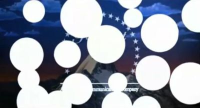
Soapdish (1991): White dots appear over the 1990 logo.
_______________________________________________________________________________________
The Godfather Part III (1990): The 2002 logo is in sepia tone. Only on the 2008 Coppola restoration.
_______________________________________________________________________________________
Soapdish (1991): White dots appear over the 1990 logo.

_______________________________________________________________________________________
Braveheart (1995): The logo has a gray tint. This was only seen on US prints of the movie. The restored US version has the standard version instead.

_______________________________________________________________________________________
The Brady Bunch Movie (1995), some Peanuts TV specials (1965-2000), and Little Bill (1999, Nick Jr.): The logo freezes and the Viacom byline zooms in further than usual.

_______________________________________________________________________________________
Clueless (1995): The logo irises out into the film's opening title.
_______________________________________________________________________________________
Mission: Impossible (1996, Paramount Home Video): There is a special version of the 1988-2006 Paramount Home Video logo. On a gold background, the camera zooms backward as we see "Paramount" in its corporate script font, with the abstract mountain logo in the circle, and 22 stars encircling it. The byline "A VIACOM COMPANY" fades in at the bottom and is smaller. As the logo plays throughout, an announcer says "Paramount Pictures: the best show in town!". This might also appear on any other Paramount video.

_______________________________________________________________________________________
A Very Brady Sequel (1996): The mountain (badly) fades into a mountain in Krabi, Thailand.
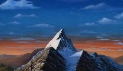
_______________________________________________________________________________________The Beautician and the Beast (1997): When the logo finishes animating, the stars, text, and byline fade out and the mountain and clouds turn more realistic. After that, the logo pans down into the film's opening scene.
_______________________________________________________________________________________
Event Horizon (1997): After the logo fully forms, the camera pans upward into space.

_______________________________________________________________________________________
Event Horizon (1997): After the logo fully forms, the camera pans upward into space.

_______________________________________________________________________________________
Hard Rain (1998): The Paramount mountain is seen in much worse weather than normal; the camera pans down from the logo to scenes of flooding.
South Park: Bigger, Longer, and Uncut (1999): The Paramount logo fades to a regular green snow-capped mountain that can be seen on pretty much every South Park episode. This was only seen on US prints of the movie, while international prints of the film use the 1999 Warner Bros. Pictures logo, but it still uses the music from the logo.
_______________________________________________________________________________________
Sleepy Hollow (1999): The logo has a gray tint, a darker version of the Braveheart variant.
_______________________________________________________________________________________
Snow Day (2000): The top half of the logo is tinted blue, and the text in the logo is in a shade of blue, thus making it look "frozen". Also, we hear a snowstorm in the background.
_______________________________________________________________________________________
Rugrats in Paris: The Movie (2000): Same as the Snow Day variant, but it's silent and the top half is in its normal colors.
________________________________________________________________________________________
Rugrats in Paris: The Movie (2000): Same as the Snow Day variant, but it's silent and the top half is in its normal colors.
________________________________________________________________________________________
Tomb Raider: The Cradle of Life (2003): The logo is reflected against an oceanic background.

_______________________________________________________________________________________
________________________________________________________________________________________
Mean Girls (2004): The "Paramount" text, as well as the stars, are in a shade of blue.
_______________________________________________________________________________________
Collateral (2004): The logo is in black and white along with the DreamWorks logo.
Alfie (2004): The logo is tinted in magenta.
_______________________________________________________________________________________
Team America: World Police (2004): The logo animates in reverse.
_______________________________________________________________________________________
Elizabethtown (2005): The 1954 logo is used but instead of "A Paramount Picture/Release" it reads "Paramount" (as in the 1968 variant), but with the byline "A Viacom Company" in the Helvetica font.
_______________________________________________________________________________________
Coach Carter (2005): The logo turns into a drawing (for a split-second) before turning back to normal. There are 25 stars circling the Paramountain in the drawing.
Four Brothers (2005): It's snowing on the Paramount logo and we hear Jefferson Airplane's "Somebody to Love".

_______________________________________________________________________________________
Zodiac (2007): Exactly like the Elizabethtown variant.
Beowulf (2007, US version): The logo starts off sped up, and then goes back to it's normal speed.
It also has the same appearance as the 2010 variant of the logo, only with the old Viacom byline.

_______________________________________________________________________________________
Drillbit Taylor (2008): The logo is in tannish red.

_______________________________________________________________________________________
The Curious Case of Benjamin Button (2008): Buttons fall down and form the Paramount logo.

______________________________________________________________________________________________
Indiana Jones and the Kingdom of the Crystal Skull (2008): Exactly like the Elizabethtown and Zodiac variants.
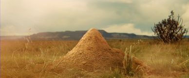
The logo then fades into a mountain made out of sand, where a CGI prairie dog pops out.
The logo then fades into a mountain made out of sand, where a CGI prairie dog pops out.
Watchmen (2009; International Release): The Paramount logo is black on a goldenrod background and is in Futura, the same font as the movie's logo.
The other three studios who co-produced the film (Warner Bros., Legendary Pictures, and DC) all have the same variation.
The other three studios who co-produced the film (Warner Bros., Legendary Pictures, and DC) all have the same variation.

_______________________________________________________________________________________
Watchmen: Under the Hood (2009): The logo is banana yellow on a black stripe between two banana yellow stripes, and the other logos (Warner Premiere, Legendary Pictures, and DC) fly in succession with the same variation.
___________________________________________________________________________________
Transformers: Revenge of the Fallen (2009): The logo appears in midnight blue.

___________________________________________________________________________________
Friday the 13th (2009): The logo is blood red.

__________________________________________________________________________________
Godfather II (2009): The Digital variant is seen on the game, and the logo is covered in blood.

___________________________________________________________________________________
The Last Airbender (2010): On the first half of the logo, the stars are replaced by water (meant to resemble water-bending).
_______________________________________________________________________________________
Grease Sing-a-Long (2010): This is a 2010 limited re-release of the 1978 film Grease. The 1975-1986 logo is used, but with the byline "A VIACOM COMPANY" in the 1990-2005 Viacom font.
_______________________________________________________________________________________
Jackass 3D (2010): The camera zooms to the right of the mountain, segueing into the new MTV Films logo.
_______________________________________________________________________________________
Megamind (2010, DreamWorks Animation): The Viacom "Wigga Wigga" font is used. Only at the end of the movie.
Megamind (2010, DreamWorks Animation): The Viacom "Wigga Wigga" font is used. Only at the end of the movie.
_______________________________________________________________________________________
Tomorrow, When the War Began (2010): The logo is cut down to just 2 seconds of the stars whooshing past and 2 seconds of the byline fading in. The Viacom byline is in its 1990-2005 font and the mountain is zoomed in so the tops of the highest 4 stars aren't seen (this is possibly an error in using the logo in the wrong aspect ratio).
_______________________________________________________________________________________
Transformers: Dark of the Moon (2011): After the logo is done, the camera pans up into space, segueing into the opening titles.

_______________________________________________________________________________________
Hugo (2011): The logo is tinted in frosty blue.
Hugo (2011): The logo is tinted in frosty blue.
_______________________________________________________________________________________
The Avengers (2012): The "100 Years" logo emerges from giant blue energy waves, and is cut to the stars circling the peak. The logo dissolves into the blue energy when it finishes.
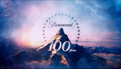
The Avengers (2012): The "100 Years" logo emerges from giant blue energy waves, and is cut to the stars circling the peak. The logo dissolves into the blue energy when it finishes.

_______________________________________________________________________________________
World War Z (2013): The current logo is in a bluish color.
_______________________________________________________________________________________
Pain & Gain (2013): The logo is bylineless.
_______________________________________________________________________________________
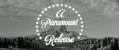
Nebraska (2013): The 1953 "A Paramount Release" logo is used with the Viacom byline (in its 2005-2019 font) below.

_______________________________________________________________________________________
Paranormal Activity: The Marked Ones (2014): The logo glitches like a video camera.
___________________________________________________________________________________________
Interstellar (2014): The logo is sepia toned.
___________________________________________________________________________________________
The Little Prince (2015): When logo almost finished, the background turn golden and stars change to Little Prince version stars. Also, there are hanging stars around the background.
_______________________________________________________________________________________
Capture the Flag (2016): The 2002 logo with the Viacom "Wigga-Wigga" byline is used.
____________________________________________________________________________________________
Teenage Mutant Ninja Turtles: Out of the Shadows (2016): The stars are replaced with shurikens, and the logo is bylineless.
____________________________________________________________________________________________
Transformers: The Last Knight (2017): The logo is tinted in midnight blue, and when it finishes, asteroids fly from the mountain and the camera pans to space.
____________________________________________________________________________________________
Daddy's Home 2 (2017): The byline fades in before the logo's animation finishes.
__________________________________________________________________________________________________
Terminator: Dark Fate (2019): The logo is sped up, glitchy and incorporated into the opening dialogue. At the end, it briefly flickers to the 1986 logo for a split-second. Only seen on US and international prints of the film.
__________________________________________________________________________________________________
Sonic The Hedgehog (2020): The stars are replaced with the golden rings as seen in the Sonic games.
