Paramount Television Service
Jump to navigation
Jump to search
Logo description by Cody E. and Shadeed A. Kelly
Logo captures by Cody E. and Pygmalion X
Editions by Shadeed A. Kelly
Video capture courtesy of metrodfclpt
Background: The Paramount Television Service ("PTS" or "PMTS" for short) was the name of a proposed but in the end unrealized "fourth television network" from Paramount Pictures (then a unit of Gulf+Western), unofficially established in 1977.
(1978, 1980-1982)
<embed height="175" src="http://wikifoundrytools.com/wiki/closinglogos/page/Paramount+Television+Service/widget/youtubevideo/763a05d7e42e97501c1e22e74a049a09a3e2565f" type="application/x-shockwave-flash" width="219" wmode="transparent"/>
Nicknames: "Mountain Silhouette", "Dark Mountain", "Rising Mountain", "Paramount Television Service"
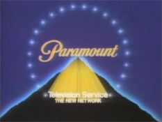
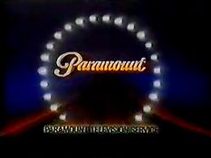
Logo: A dark mountain with a light blue outline is seen against a pitch-black background. Suddenly, a large flash of light is seen at the mountain's peak, and several of these lights zoom in from the peak to the center of the screen. The "Paramount" script, which is yellow, can be seen zooming in with the lights, which then arrange themselves in a near-circle of 22 star-like lights. An elongated orange beam also zooms in to the bottom of the screen, and once everything is arranged, the orange beam transforms into the words "PARAMOUNT TELEVISION SERVICE". During all of this, the light blue outline transitions to orange.
Trivia:
Variant: An earlier version made in 1978, with a brighter background, simplified animation, and a byline reading "THE NEW NETWORK", was ultimately featured on the demo reel for the logo's designer, Sullivan & Marks, which you can view <a href="https://youtu.be/YclB-1DtYfU?t=41s" target="_self">here</a>.
FX/SFX: The lights and the words "Paramount" and "Paramount Television Service" zooming in.
Music/Sounds: The 1979 Paramount Television theme.
Music/Sounds Variant: It has been said that this logo was once plastered over a 1976 "Blue Mountain" logo with the final Jerry Goldsmith music.
Availability: Extinct. It was only on a select number of shows, such as the first season of Solid Gold, to begin with, VH1 airings of Solid Gold from 1998-99 has this logo plastered by the silent 1995 Domestic Mountain. The original VHS and PAL DVD releases of A Woman Called Golda replaced this with a silent version of the 1975 Paramount Television logo and the NTSC DVD release has the CBS Television Distribution logo.
Editor's Note: The scanimation would actually be ahead of its time if not for the film quality. The "stars" also look more like glowing balls of lights than anything else, and the "Paramount" script looks rather odd. Still, an admirable effort for the late '70s/early '80s.
Logo captures by Cody E. and Pygmalion X
Editions by Shadeed A. Kelly
Video capture courtesy of metrodfclpt
Background: The Paramount Television Service ("PTS" or "PMTS" for short) was the name of a proposed but in the end unrealized "fourth television network" from Paramount Pictures (then a unit of Gulf+Western), unofficially established in 1977.
(1978, 1980-1982)


<embed height="175" src="http://wikifoundrytools.com/wiki/closinglogos/page/Paramount+Television+Service/widget/youtubevideo/763a05d7e42e97501c1e22e74a049a09a3e2565f" type="application/x-shockwave-flash" width="219" wmode="transparent"/>
Nicknames: "Mountain Silhouette", "Dark Mountain", "Rising Mountain", "Paramount Television Service"
Logo: A dark mountain with a light blue outline is seen against a pitch-black background. Suddenly, a large flash of light is seen at the mountain's peak, and several of these lights zoom in from the peak to the center of the screen. The "Paramount" script, which is yellow, can be seen zooming in with the lights, which then arrange themselves in a near-circle of 22 star-like lights. An elongated orange beam also zooms in to the bottom of the screen, and once everything is arranged, the orange beam transforms into the words "PARAMOUNT TELEVISION SERVICE". During all of this, the light blue outline transitions to orange.
Trivia:
- The logo was actually supposed to be a television station ident; it was around this time that a fourth commercial network by Paramount was in the works, but plans eventually fell through.
- Eventually, new footage would be added to the beginning of the logo and the words "HOME VIDEO" would be chyroned over "PARAMOUNT TELEVISION SERVICE" to create Paramount Home Video's second logo.
Variant: An earlier version made in 1978, with a brighter background, simplified animation, and a byline reading "THE NEW NETWORK", was ultimately featured on the demo reel for the logo's designer, Sullivan & Marks, which you can view <a href="https://youtu.be/YclB-1DtYfU?t=41s" target="_self">here</a>.
FX/SFX: The lights and the words "Paramount" and "Paramount Television Service" zooming in.
Music/Sounds: The 1979 Paramount Television theme.
Music/Sounds Variant: It has been said that this logo was once plastered over a 1976 "Blue Mountain" logo with the final Jerry Goldsmith music.
Availability: Extinct. It was only on a select number of shows, such as the first season of Solid Gold, to begin with, VH1 airings of Solid Gold from 1998-99 has this logo plastered by the silent 1995 Domestic Mountain. The original VHS and PAL DVD releases of A Woman Called Golda replaced this with a silent version of the 1975 Paramount Television logo and the NTSC DVD release has the CBS Television Distribution logo.
Editor's Note: The scanimation would actually be ahead of its time if not for the film quality. The "stars" also look more like glowing balls of lights than anything else, and the "Paramount" script looks rather odd. Still, an admirable effort for the late '70s/early '80s.