Gary Reilly Productions (Australia)
Jump to navigation
Jump to search
Logo descriptions by mr3urious
1st Logo
(February 11, 1987-March 6, 1991)
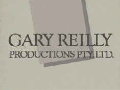
Logo: Over the end credits, two halves of the words
on a beige background with a dark gray square above it, slide in diagonally from opposites sides of the screen and turn to face us. The square disappears and the words then flip around to reveal the words
Variants:
Cheesy Factor: Not much thought was put into this logo.
Music/Sounds: Just the end theme of the show coupled with an end spiel that would vary from show to show. There would be different variants of said spiel.
Editor's Note: None.
2nd Logo
(March 13, 1991-August 17, 1994)
Logo: Over the end credits, a painting of a TV screen, which is made up of a round blue airbrush stroke, a round red paintbrush stroke, and a yellow dot with a pair of TV antennae above it against a white background, "unrolls" onto the screen. The words "Gary Reilly Productions", in Times New Roman, stick themselves at the top. Then, it flips around to reveal the Seven Network logo from the time, but in black (see the variants section from the previous logo for details).
FX/SFX: The rolling and flipping.
Music/Sounds: The end theme of the show with the same spiel from before, but with "Seven Network" in place of "Australian Television Network".
Availability: Seen on the last ten seasons of Hey Dad...!
Editor's Note: None.
1st Logo
(February 11, 1987-March 6, 1991)
Logo: Over the end credits, two halves of the words
GARY REILLY
PRODUCTIONS PTY. LTD.
PRODUCTIONS PTY. LTD.
on a beige background with a dark gray square above it, slide in diagonally from opposites sides of the screen and turn to face us. The square disappears and the words then flip around to reveal the words
AUSTRALIAN
TELEVISION
NETWORK
Variants:
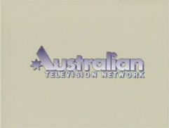
- Between 1990 and 1991, the ATN logo from the time (which is purplish and features the A made up of a star and a diagonal line) was used instead.
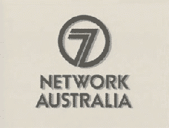
- In the very final years of the logo's use, when the Australian Television Network would be renamed Seven Network, the text would fade to said logo, consisting of a stylized "circle 7" with "NETWORK AUSTRALIA" below it, all in gray.
Cheesy Factor: Not much thought was put into this logo.
Music/Sounds: Just the end theme of the show coupled with an end spiel that would vary from show to show. There would be different variants of said spiel.
- Hey Dad...!: "This show is recorded in front of a live audience. Hey Dad...! is a Gary Reilly Production for the Australian Television Network/Seven Network."
Editor's Note: None.
2nd Logo
(March 13, 1991-August 17, 1994)
Logo: Over the end credits, a painting of a TV screen, which is made up of a round blue airbrush stroke, a round red paintbrush stroke, and a yellow dot with a pair of TV antennae above it against a white background, "unrolls" onto the screen. The words "Gary Reilly Productions", in Times New Roman, stick themselves at the top. Then, it flips around to reveal the Seven Network logo from the time, but in black (see the variants section from the previous logo for details).
FX/SFX: The rolling and flipping.
Music/Sounds: The end theme of the show with the same spiel from before, but with "Seven Network" in place of "Australian Television Network".
Availability: Seen on the last ten seasons of Hey Dad...!
Editor's Note: None.
