Rai (Italy)
Jump to navigation
Jump to search
Background: RAI — Radiotelevisione italiana S.p.A. (commercially styled Rai known until 1954 as Radio Audizioni Italiane) is Italy's national public broadcasting company founded in 1954. In 1950, RAI became one of the 23 founding broadcasting organizations of the European Broadcasting Union.
1st Logo
(1954-1983)
<iframe align="bottom" frameborder="0" height="200" src="http://wikifoundrytools.com/wiki/closinglogos/widget/unknown/c867bd385d977f9554f1494266a265467c149c4b" width="353"></iframe>
NOTE: B&W variant is seen at 0:30, and colored variant is the one shown at 1:14.
Nicknames: Sky Wireframes
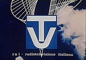
Logo: On a scrolling sky background, a black square (blue in the colored version) consisting of a white stacked "TV" logotype fades in, with the name "r a i - radio televisione italiana" seen below. Various abstract 2D wireframe figures then scroll down and cover the background, as the logo fades in and out with each 10 seconds.
FX/SFX: The scrolling, the fading. Overall, the logo looks decades ahead of its time, giving reason for its longevity.
Music/Sounds: A majestic fanfare, that's actually part of the ending of the opera William Tell by Gioachino Rossini.
Availability: Extinct. Was seen on startups and closedowns from the channel during it's 30 years of use.
Editor's Note: This was a memorable logo from the point of view of various Italians.
.
.
.
2nd Logo
(1983-1985)
Nickname: "The Three Shapes"
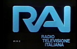
Logo: On a black background with a yellowish ground made of squares there's an floating azure flat version of the Rai logo from 1983-2000. We scroll in while a blue sphere, a red square and a green tetrahedron (original symbols of the 3 Rai generic channels) come in one at times and goes up the letter "A" of the words "RAI". The camera follows the shapes until the Rai logo is framed on the screen along with the squared ground. we see the 3 shapes going away from the screen and then the squared ground rotating away in the black background. The words "RADIO TELEVISIONE ITALIANA" appears one word at time.
FX/SFX: Early CGI, but it looks pretty good for the time.
Music/Sounds: A calm, yet eerie synth and three sounds when "RADIO", "TELEVISIONE" and "ITALIANA" appears.
Availability: Extinct, used for a short time on several Rai transmissions
Editor's Note: The theme, resulting darkness, and big blue lettering at the end can get to a few, but the logo's mostly nice and the music can be a favorite to many.
3rd Logo
(1985-1988)
 <iframe frameborder="0" height="204" src="http://wikifoundrytools.com/wiki/closinglogos/widget/unknown/225f4d8d419cde718dfa42f0e85f3cd85e6bf723" width="271"></iframe>
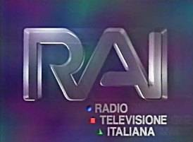
Nickname: "The Three Shapes II"
Logo: On a blue/purplesmoking background, we see the same three shapes of the logo before flying right to the screen releasing contrails of their color. They pass a glass version of the "RAI" wordmark of precedent logo who rotates an zooms down in almost the center of the screen and "RADIO TELEVISIONE ITALIANA" fades one word at time while the three shapes goes in the place of the words "RADIO", "TELEVISIONE" and "ITALIANA".
FX/SFX: Even better CGI than the precedent one, holds great for the time.
Music/Sounds: A piano-like theme who ends with three notes. Similar to the previous logo but a bit sped up.
Availability: Extinct. Used on several transmissions from 1985 to 1988
Editor's Note: None.
4th Logo
(1988-1993)
<iframe frameborder="0" height="183" src="http://wikifoundrytools.com/wiki/closinglogos/widget/unknown/9d9063032d763bc2dbc40ebb883a51ab1ea1b3b0" width="243"></iframe><iframe frameborder="0" height="186" src="http://wikifoundrytools.com/wiki/closinglogos/widget/genericvideo/ce3f4f88f09c724ee4f5932c6eb057425c52f652" width="329"></iframe>
Nickname: "The Three Shapes III"
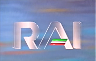
Logo: On a smokyorange background, we see the three shapes from the precedent logos. They fly right to the screen where we see the letters of the wordmark of the precedent logos. The background becomes blue and the sphere becomes white. All the three shapes become horizontal lines, the glass word "RAI" goes to the center of the screen and the lines go to replace the horizontal line of the "A".
Variant: After 1991, the lines were vertical, to reflect Italy's flag.
FX/SFX: Same CGI as before.
Music/Sounds: A theme who always ends with three notes, which resembles the one of the precedent logo.
Availability: Used on several transmission from the late 80's to the early 90's.
Editor's Note: None.
5th Logo
(1993-2000)
 <iframe frameborder="0" height="202" src="http://wikifoundrytools.com/wiki/closinglogos/widget/unknown/c8a1c1fe12542e49a52dbe0fb550153f52e29839" width="358"></iframe>
Nicknames: "Crystals", "Crayon", "No Three Shapes"
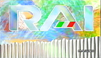
Logo: On a yellow background, we see some crayon paints of various colors coming out. When the screen is filled by crayon marks, a barrier made of crystal lines comes from down of the screen and the RAI logo from the time, made of glass, with the horizontal line on the "A" with the colors of the Italian flag fades.
FX/SFX: The crayon paints moving, the background moving.
Music/Sounds: An collision of 7 notes with 3 different musical instruments (piano, electric guitar, and saxophone) with the same notes.
Availability: Used on several transmissions until 2000.
Editor's Note: The theme is a favorite of many.
6th Logo
(2000-2010)
Nickname: "The Rai Butterfly"
Logo: On a blue background we see the half part of the 2000 Rai butterfly logo. It opens his second part, the words "Rai" (in Ollie Wollie Bold font) fades in and 2 seconds later the logo fades away.
FX/SFX: The butterfly opening and the fading.
Music/Sounds: A short dramatic fanfare.
Availability: Used on programs broadcasted by Rai until 2010.
Editor's Note: None.
7th Logo
(2010-)

Nicknames: "The Rai Square", "Still Square", "Square of Boredom"
Logo: We just see the new Rai logo (a blue square with the words "Rai" in white in the same wordmark of before) fading in and out.
FX/SFX: The fading.
Music/Sounds: None.
Availability: Currently in use in some Rai's programming. This is likely to be seen after the Eurovision logo on each broadcast of the yearly contest in Italy.
Editor's Note: None, it's just boring.
