Colombiana de Television (Colombia)
Jump to navigation
Jump to search
Logo descriptions by TrickyMario7654 and rj4712
Photo captures by SnowflakesOmega
Video captures courtesy of ecorreacardona, televindentecolombia and lurangel0
Editions by MegaAveron25
1st Logo
(1979-1990)

<embed allowfullscreen="true" height="179" src="http://wikifoundrytools.com/wiki/closinglogos/widget/youtubevideo/2394022d0dbb4d1aba98b26c2e290b0b1c141a5c" type="application/x-shockwave-flash" width="232" wmode="transparent"/><embed allowfullscreen="true" height="181" src="http://wikifoundrytools.com/wiki/closinglogos/widget/youtubevideo/f86af9c1ab86fd3dc52006477cd25eb46d64cd8e" type="application/x-shockwave-flash" width="214" wmode="transparent"/>
Nicknames: "The Colombian Fire Alarm", "The Colombian UFO", "Irritating Colombian Alarm"
 <iframe frameborder="0" height="204" src="http://wikifoundrytools.com/wiki/closinglogos/widget/genericvideo/42f5992ef8785a7829944c15e9a799011125dcd0" width="271"></iframe>
Nicknames: "The Colombian Fire Alarm II", "The Colombian UFO II", "Bleachers", "Stairs", "The Stadium", "Irritating Colombian Alarm II"
Logo: A transparent teal-white beam falls in between a series of rings arranged like stadium seats. The camera rotates 360 degrees around the seats which are colored yellow, blue and red (the Colombian national colors). The camera stops between an opening of two sections. We enter the giant ring as the teal-white beam sinks into the ground. The seats fall onto alignment. The pieces turn and form the design of the 1st logo. The logo flies off of the base. From the middle of the logo is the word "Colombiana" written in the same font as the 1st logo. The words "de televisiόn" flies from the top of the screen and lands below Colombiana. The base shrinks to become a white bar which settles between the company name.
FX/SFX: Computer animation, adding to the 360 effect.
Music/Sounds: Same as the 1st logo, only a bit quieter.
Music/Sounds/Voice-over Variant: Sometimes, we also hear an announcer that says something including the company name in Spanish.
Availability: Extinct.
Editor's Note: While the animation is primitive and choppy by today's standards and we still have the startling sounds, the logo is tamer due to the animation.
3rd Logo
(2010-2013)
 <iframe frameborder="0" height="185" src="http://wikifoundrytools.com/wiki/closinglogos/widget/genericvideo/74c27e5d0c93b0ddeaca4efd56e0d5a69ffad1c9" width="327"></iframe>
Logo: On a black background with many computerized circle edges, the text "Una produccion de: (A production of)" fades in, then a flash appears appears and we see the rings from the previous logo, but in the same thickness, spinning around. Then, while it stops, this time, the text:
 <iframe frameborder="0" height="207" src="http://wikifoundrytools.com/wiki/closinglogos/widget/unknown/a423c53e81b1f83a2cfd8e623b3720db06235514" width="366"></iframe>
Photo captures by SnowflakesOmega
Video captures courtesy of ecorreacardona, televindentecolombia and lurangel0
Editions by MegaAveron25
1st Logo
(1979-1990)

<embed allowfullscreen="true" height="179" src="http://wikifoundrytools.com/wiki/closinglogos/widget/youtubevideo/2394022d0dbb4d1aba98b26c2e290b0b1c141a5c" type="application/x-shockwave-flash" width="232" wmode="transparent"/><embed allowfullscreen="true" height="181" src="http://wikifoundrytools.com/wiki/closinglogos/widget/youtubevideo/f86af9c1ab86fd3dc52006477cd25eb46d64cd8e" type="application/x-shockwave-flash" width="214" wmode="transparent"/>
WARNING: THE SECOND VIDEO IS VERY LOUD, SO PLEASE TURN DOWN THE VOLUME BEFORE WATCHING IT.
Nicknames: "The Colombian Fire Alarm", "The Colombian UFO", "Irritating Colombian Alarm"
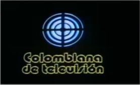
Logo: On a black background, a thick cyan fluorescent ring cut in four pieces zooms out and settles near the top. After it settles, a thinner ring cut in four zooms out and settles outside the thick ring. Followed by a thinner ring and then an even thinner ring. When the entire logo settles, a white line wipes in below. The words "Colombiana de televisiόn" rotate into view in a yellow outlined version of the Bauhaus 93 font.
FX/SFX: Scanimation is used to create the zooming and the name wiping.
Music/Sounds: A descending UFO sound followed by a four note analog/Moog-like synth tune. Sometimes the logo is interrupted by an announcer before cutting to another logo. The logo produces an intense ringing sound (similar to the sounds that one with tinnitus would hear), and the quality is very poor.
Availability: Extinct.
Editor's Note: The loud UFO sound is extremely startling, and can catch some people off-guard whenever they're not expecting it. What's more, the use of a black background and chrome logo doesn't make it look nice. Also, the way that the text is handled makes it say "Colombiana de teleuisiόn", and isn't even centered properly.
2nd Logo
(1990-2010)
 <iframe frameborder="0" height="204" src="http://wikifoundrytools.com/wiki/closinglogos/widget/genericvideo/42f5992ef8785a7829944c15e9a799011125dcd0" width="271"></iframe>
Note: The logo in the first video begins at 0:29.
Logo: A transparent teal-white beam falls in between a series of rings arranged like stadium seats. The camera rotates 360 degrees around the seats which are colored yellow, blue and red (the Colombian national colors). The camera stops between an opening of two sections. We enter the giant ring as the teal-white beam sinks into the ground. The seats fall onto alignment. The pieces turn and form the design of the 1st logo. The logo flies off of the base. From the middle of the logo is the word "Colombiana" written in the same font as the 1st logo. The words "de televisiόn" flies from the top of the screen and lands below Colombiana. The base shrinks to become a white bar which settles between the company name.
FX/SFX: Computer animation, adding to the 360 effect.
Music/Sounds: Same as the 1st logo, only a bit quieter.
Music/Sounds/Voice-over Variant: Sometimes, we also hear an announcer that says something including the company name in Spanish.
Availability: Extinct.
Editor's Note: While the animation is primitive and choppy by today's standards and we still have the startling sounds, the logo is tamer due to the animation.
3rd Logo
(2010-2013)
 <iframe frameborder="0" height="185" src="http://wikifoundrytools.com/wiki/closinglogos/widget/genericvideo/74c27e5d0c93b0ddeaca4efd56e0d5a69ffad1c9" width="327"></iframe>
Nicknames: "The Colombian Fire Alarm III", "The Colombian UFO III"
Colombiana
de televisiόn S.A.
fades in with a more modified version of Bauhaus 93 like the previous logos, comes under the rings, while it came from the right.
FX/SFX: The background, the flash, the ring spinning, the fading in.
Music/Sounds: A shortened version of the familiar theme: after the UFO sound, it fades to the last synth note. A whoosh is also heard when the rings are spinning around.
Availability: Rare/extinct.
Editor's Note: The music is still surprising and the whoosh sound can also scare unexpecting viewers, but the short length and even more tame animation would be OK for other viewers.
4th Logo
(2013- )
 <iframe frameborder="0" height="207" src="http://wikifoundrytools.com/wiki/closinglogos/widget/unknown/a423c53e81b1f83a2cfd8e623b3720db06235514" width="366"></iframe>
Nicknames: "The Colombian Fire Alarm IV", "The Colombian UFO IV"
Logo: As a blue spotlight background focuses in a logo consisting of an improved version of the rings of the previous 2 logos and the words "Colombiana de Televisiόn" in two lines spin in. The logo keeps on slowly spinning as a shine passes through it.
FX/SFX: The screen focusing in, the logo spinning and shining.
Music/Sounds: A low-pitched version of the shortened theme from before.
Availability: Currently seen on productions by the company.
Editor's Note: It would still get people with the slight change of the music's pitch, even for those who were familiar with the normal version of it.